Look for the Helpers
Designed a platform to connect New Yorkers to local resources and one-on-one help from people with experience in the fields of healthcare, finance, education, and housing.
Discovery & Research
The Problem
How might we make it easier and more humane for New Yorkers to navigate city, community, and non-profit resources?
Often, the hardest part of getting help when you need it isn't that the resources don't exist, but that it's too hard to navigate all the associated systems and bureaucracies.


To solve this problem my team designed Look for the Helpers, a site that provides a database of vetted information focused on health, housing, finance, and education alongside a portal that connects people who need help navigating systems to real, live fellow New Yorkers who have experience with those systems.
Brought in by the client at the early stages of ideation, my team and I took rough ideas for meeting an unmet need in the market and refined them into a viable, usable product.
This project was researched, designed, and led by our team of entirely POC and LGBTQ women as our capstone project for the CUNY UX design program.
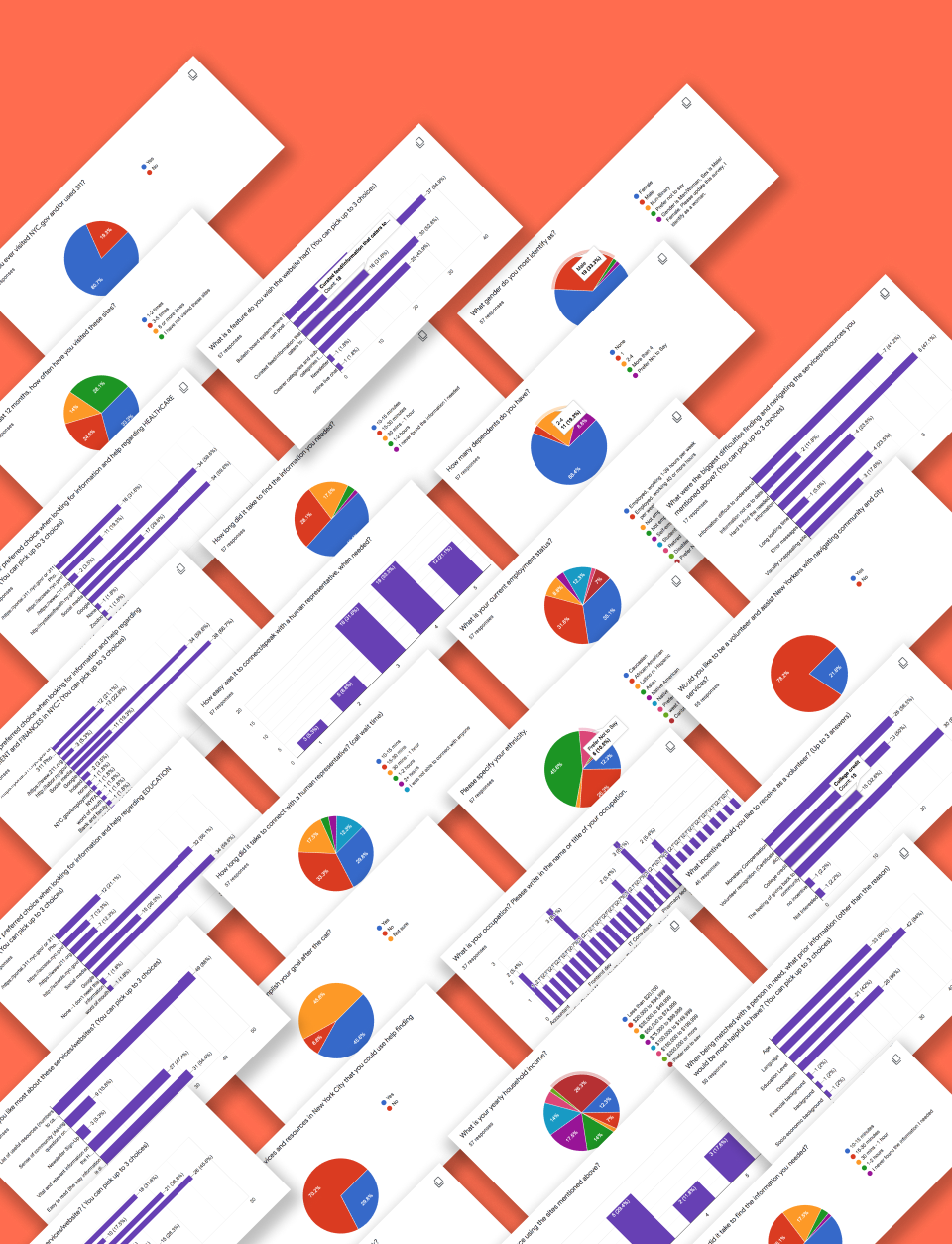
We started with research, surveying over 55 New Yorkers from a diverse range of ages, races, incomes, employment statuses, and careers to better understand our users and the problems they faced when seeking information and resources.
Our goal was to center the design process on product desirability from the onset, ensuring we were creating something that would not only solve real problems but that people would also love to use.
Research Insights
Overwhelmed
Search results are often overwhelming, people have a hard time knowing where to start.
Frustrated
Information that's to hard to find, hard to understand, and hard to trust are major frustrations people face when searching for information and resources online.
Giving back
People want to help. 80% of respondents said they've had an interest in using their expertise to help others, with 64% saying the sense of giving back to their community would be the greatest incentive for offering their expertise as a helper.
More dignity!
People told us that many social service program websites feel cold and institutional. This paired with how hard it often is to connect with a real human being leaves many people feeling like just another number in a system that doesn't see or value them.
More lists!
People want lists of useful resources. They want them to be well-organized, all in one place, and up-to-date.
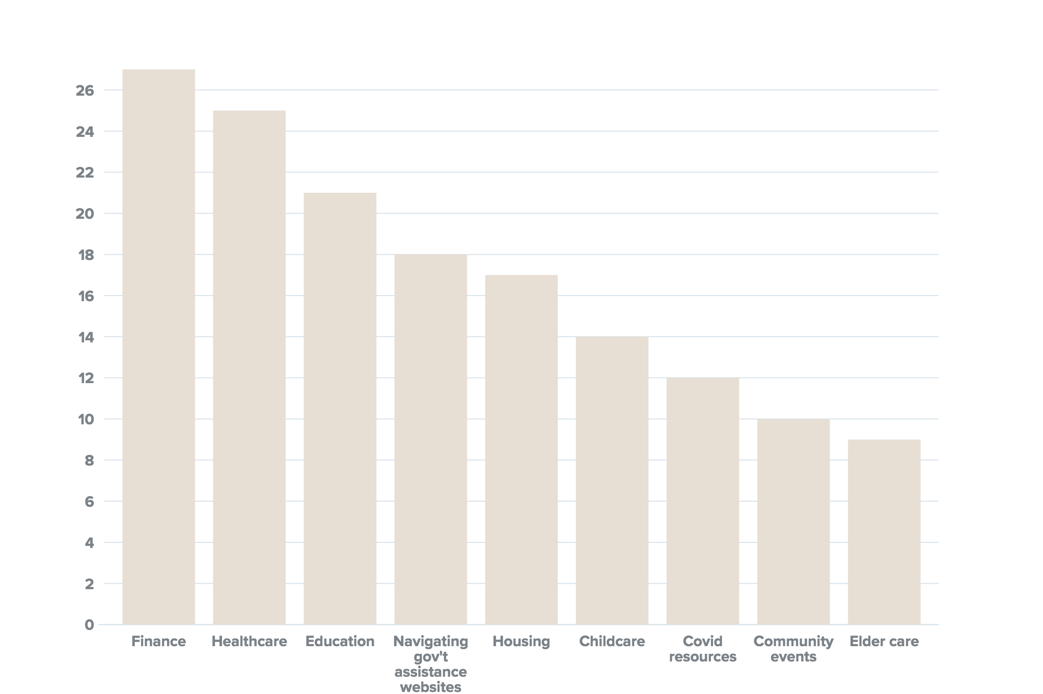
Finance
Healthcare
Education
Housing
These topped the list when we asked which arenas people need the most help navigating.
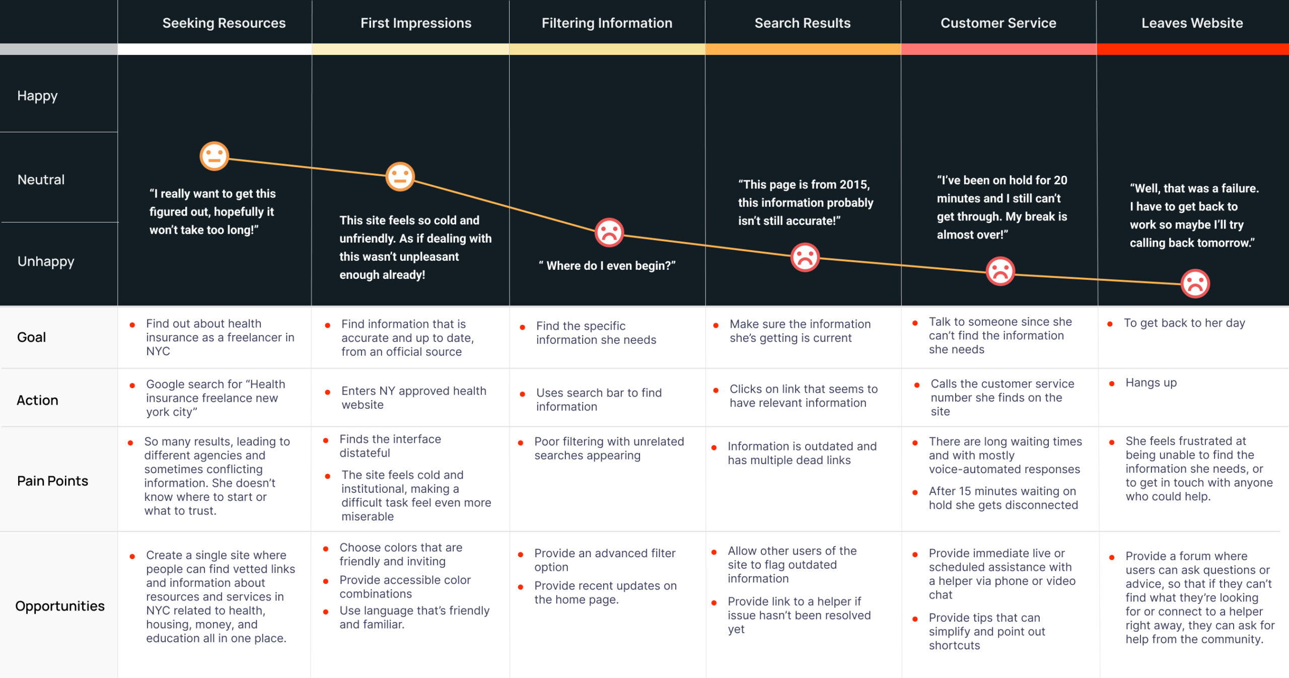
User Journey
The current experience our primary persona, Andrea, might have when seeking information about health insurance as a freelancer in Brooklyn.
User Stories
Working from a user-centered design approach, we distilled the insights we gained from our research into user stories, which helped keep our team focused on what we’re building, why we’re building it, and the benefit it will offer to users.
As a seeker, I want to...
- Easily search for information by topic.
- Find information that’s relevant, accurate, and up to date.
- Be matched with a helper via phone/video.
- Access content according to my preferred language.
As a helper, I want to...
- Be matched with seekers based on my area of expertise.
- Be matched with seekers according to preferred language.
- Share resources that may be helpful to the community.
- Be recognized on the site.
Must haves
We used this data to define the core set of product features for our MVP.
- Clear categorization into 4 main resource categories with the ability to sub-filter each.
- Prominent search bar with advanced filtering options.
- Language and visual accessibility toggles to ensure that all of New York City's diverse population is able to access the site comfortably.
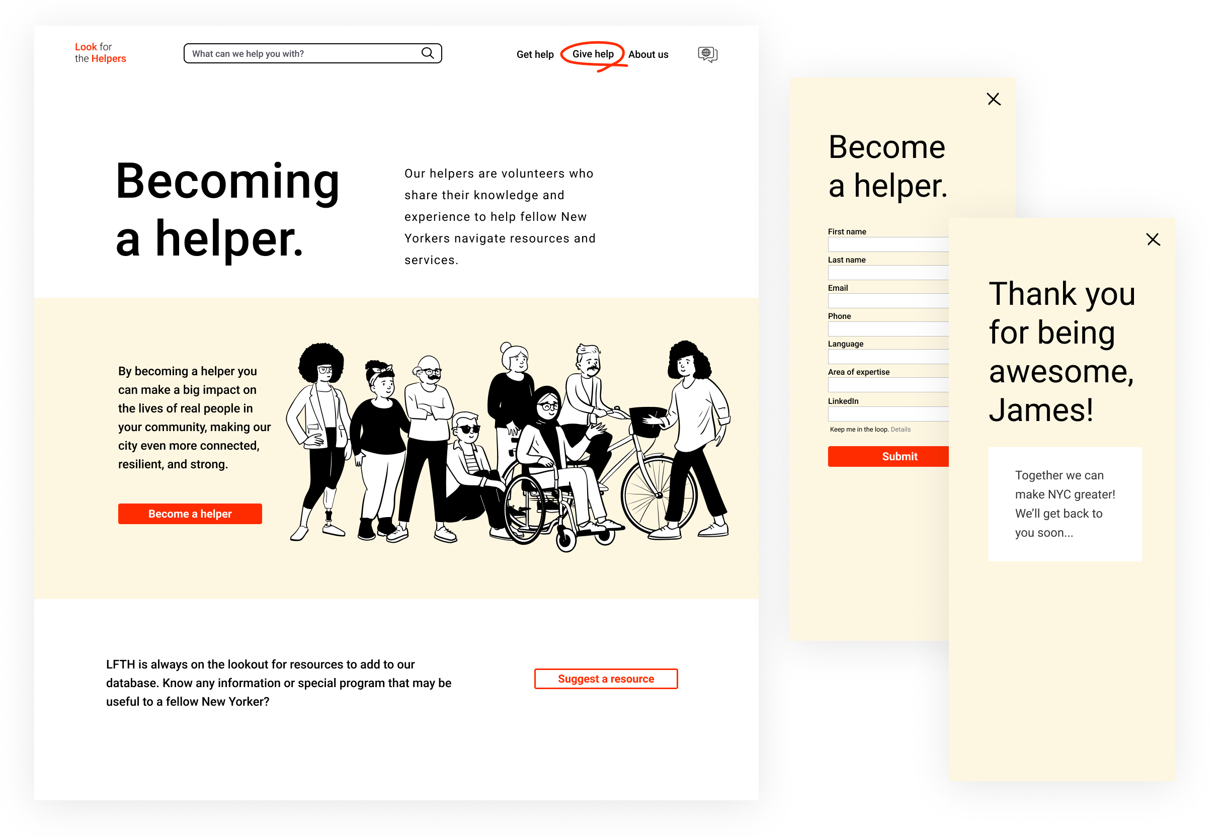
- One-click video/voice connection to a helper with experience in the relevant field.
- Friendly, clear language that isn't cold or institutional.
- Upvoting system for linked content to provide a steady stream to social feedback and ensure information is relevant and up-to-date.
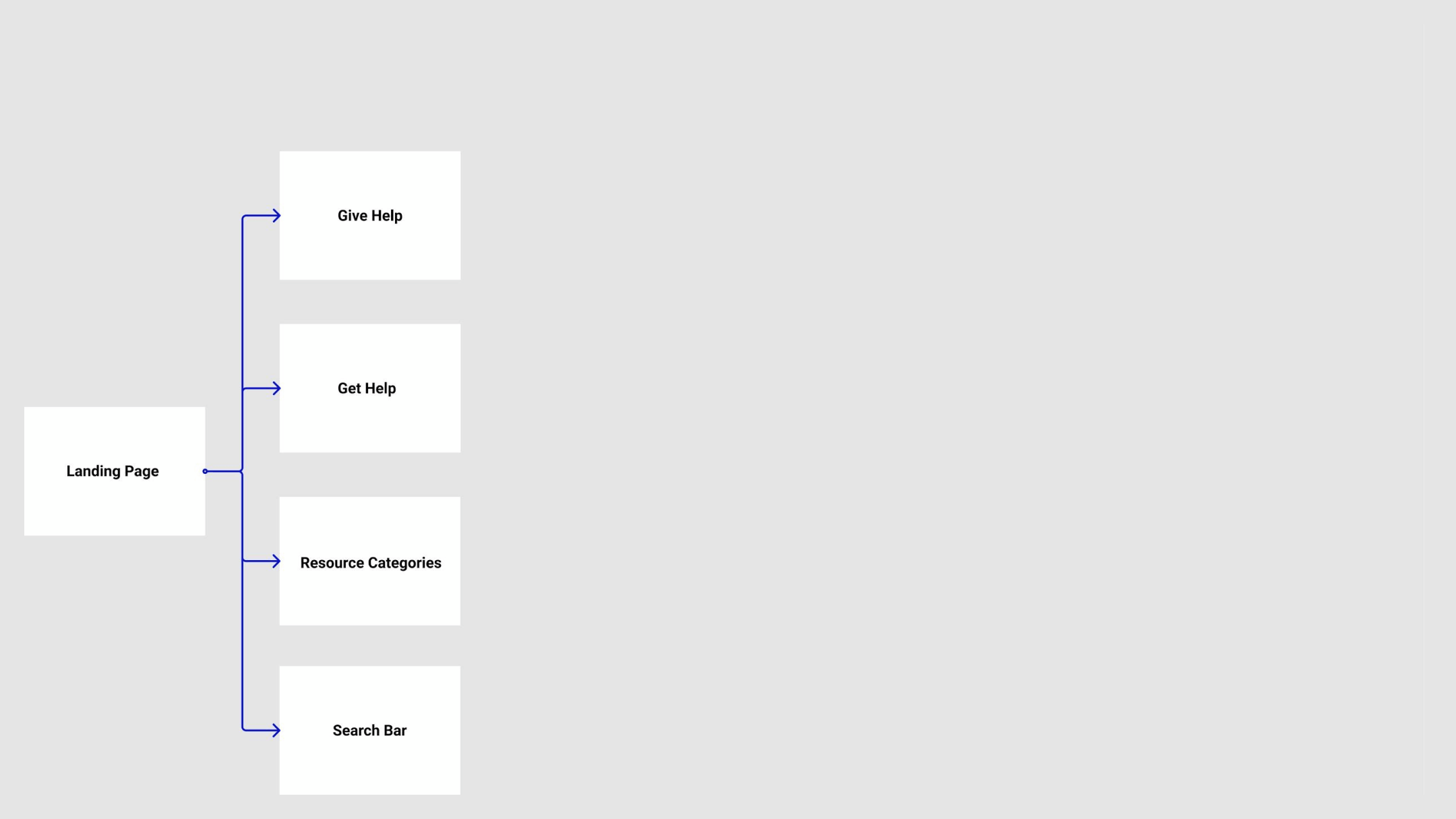
Information Architecture
At some point we all need a hand, and at another we lend one. Inspired by this mutuality, my goal was to create a sense of empowerment and reciprocity that is often lacking in the social services sector. I designed the site's information architecture around the principle of shared give-and-take, allowing users to easily move between seeking and offering help. Through usability testing I also ensured the organization and structure of content matched the mental models of our users.
These flows chart the two key branches of the product: the resource database and the connection portal that connects seekers and helpers in real-time.
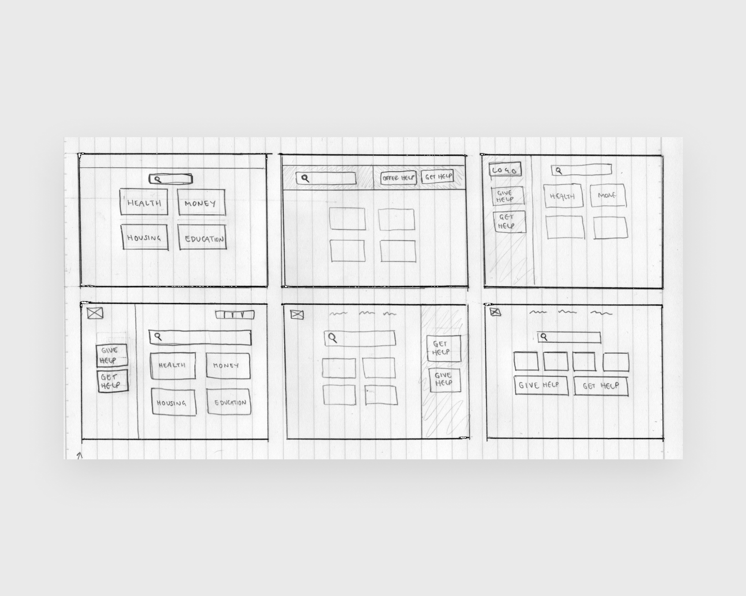
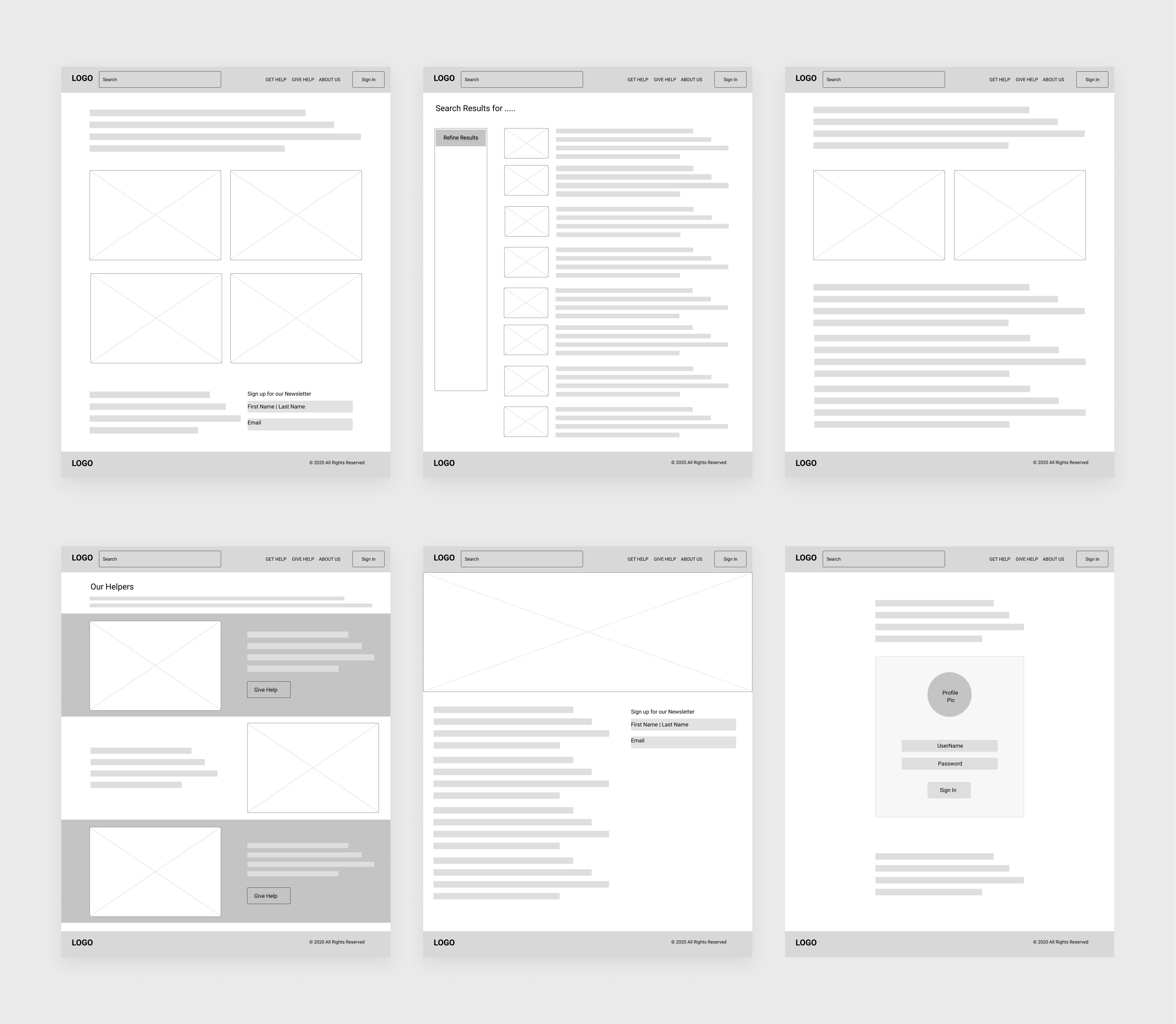
Sketching
Wireframes
Usability Testing
I performed remote, moderated usability testing at the mid-fidelity wireframe stage. The feedback from users was incredibly valuable and prompted us to make several changes to the design:
What is this anyway?
- Since its proposition is novel within the realm of social service and resource aggregation sites, some users were confused about the concept of the site.
- We addressed this by adding a welcome blurb featuring the site’s mission more prominently on the home page. We located this in a banner below the primary navigation rather than further down the page hierarchy in “About Us”.
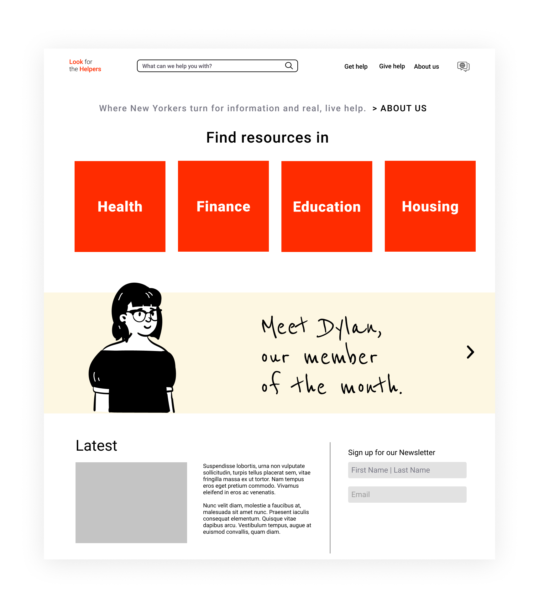
Homepage - Before Usability Testing
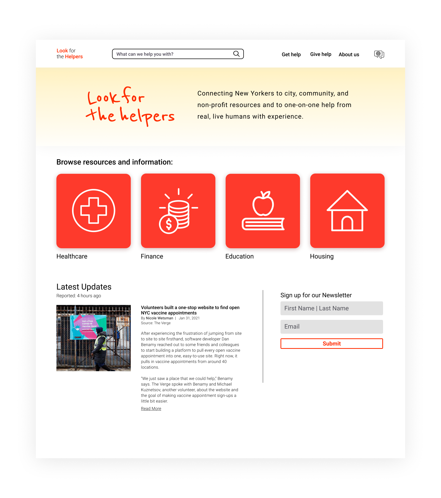
Homepage - After Usability Testing
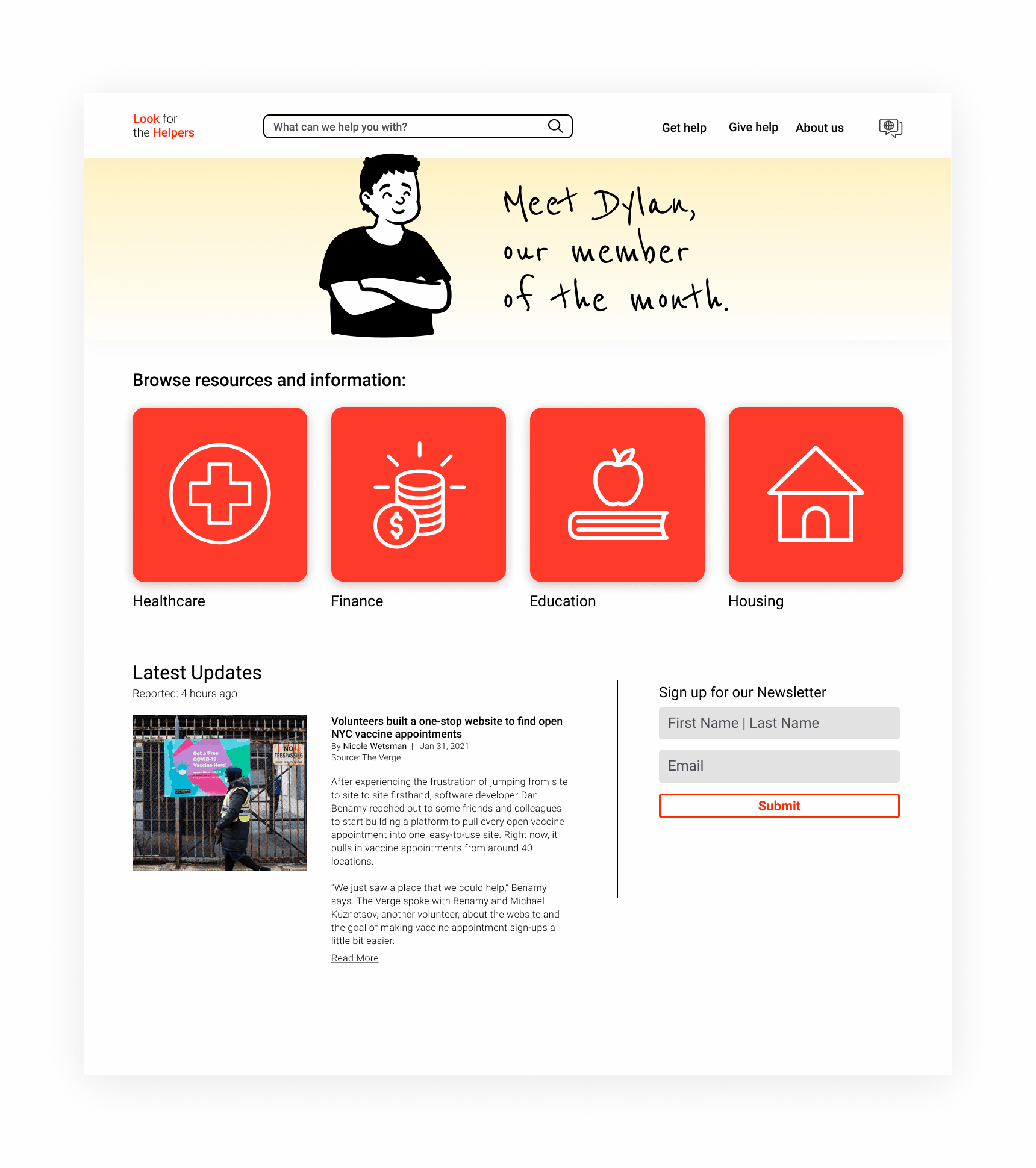
Building trust.
- Participants expressed hesitation about being connected to a stranger.
- We addressed this by incorporating the “Member of the Month” section.
- Creating connection and trust between strangers is what LFTH is built on. By highlighting individuals and moving from an abstract concept to a human face, we sought to build this sense of humanity and individuality into the visual design of the site.
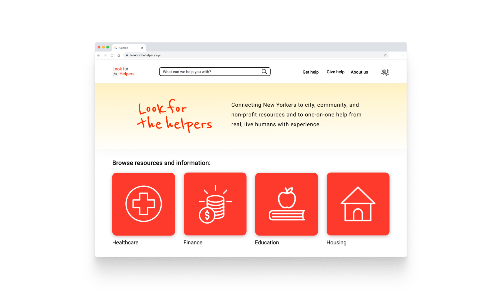
Home Page
Designed with accessibility and inclusivity at top of mind:
- Multiple language options.
- Font sizing and contrast ratios accessible for users with low vision.
- Navigational structure that is intuitive and easy for a wide range of people to use.
Main Features:
- Browse resources via search, 4 main categories, or Get help button.
- Rotating banner further explains the the site's concept, and a “Member of the month” is featured to highlight the human connection LFTH is built upon.
- Latest updates section keeps content adaptive and relevant, and newsletter sign up helps keep users engaged after they leave the site.
Getting Help
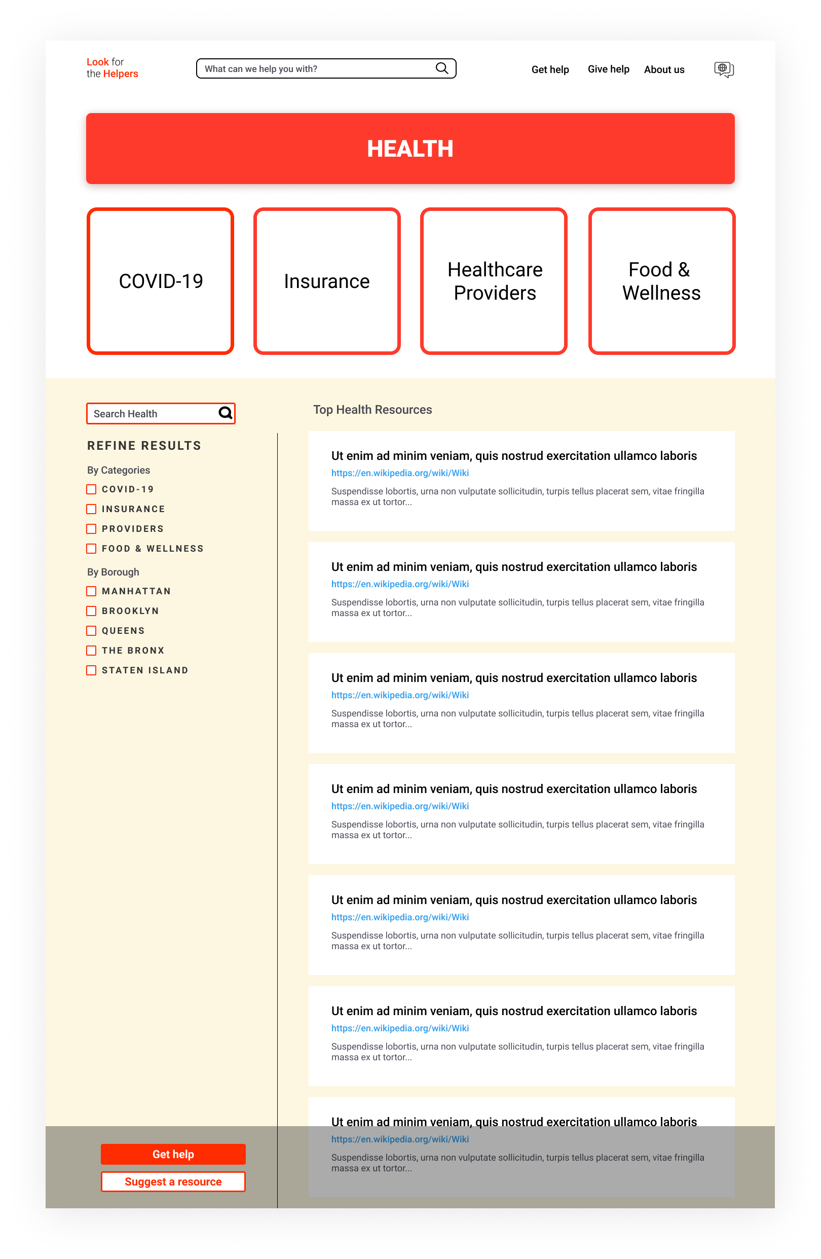
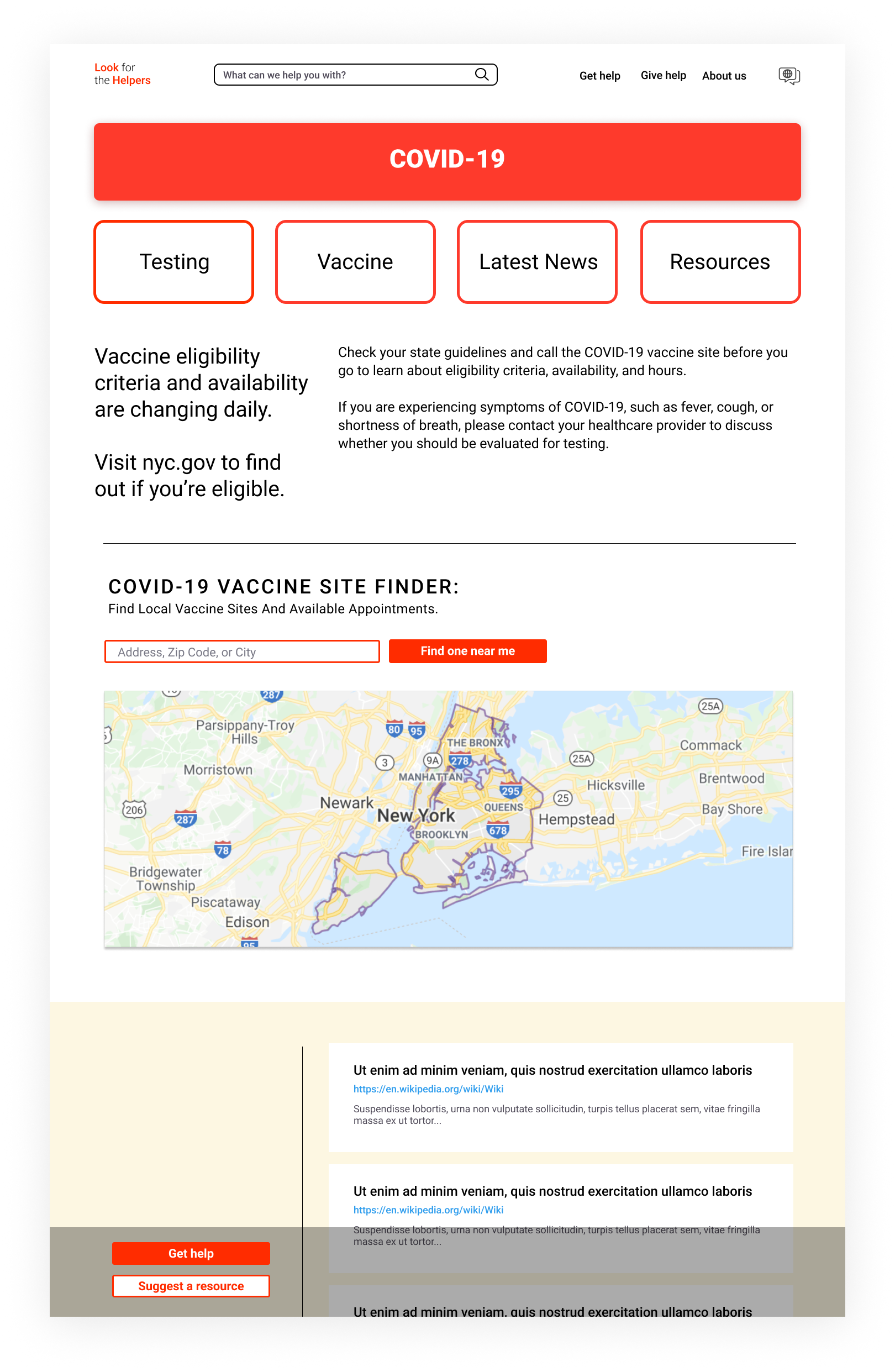
Category Page
- Results can be further refined by subcategory and borough.
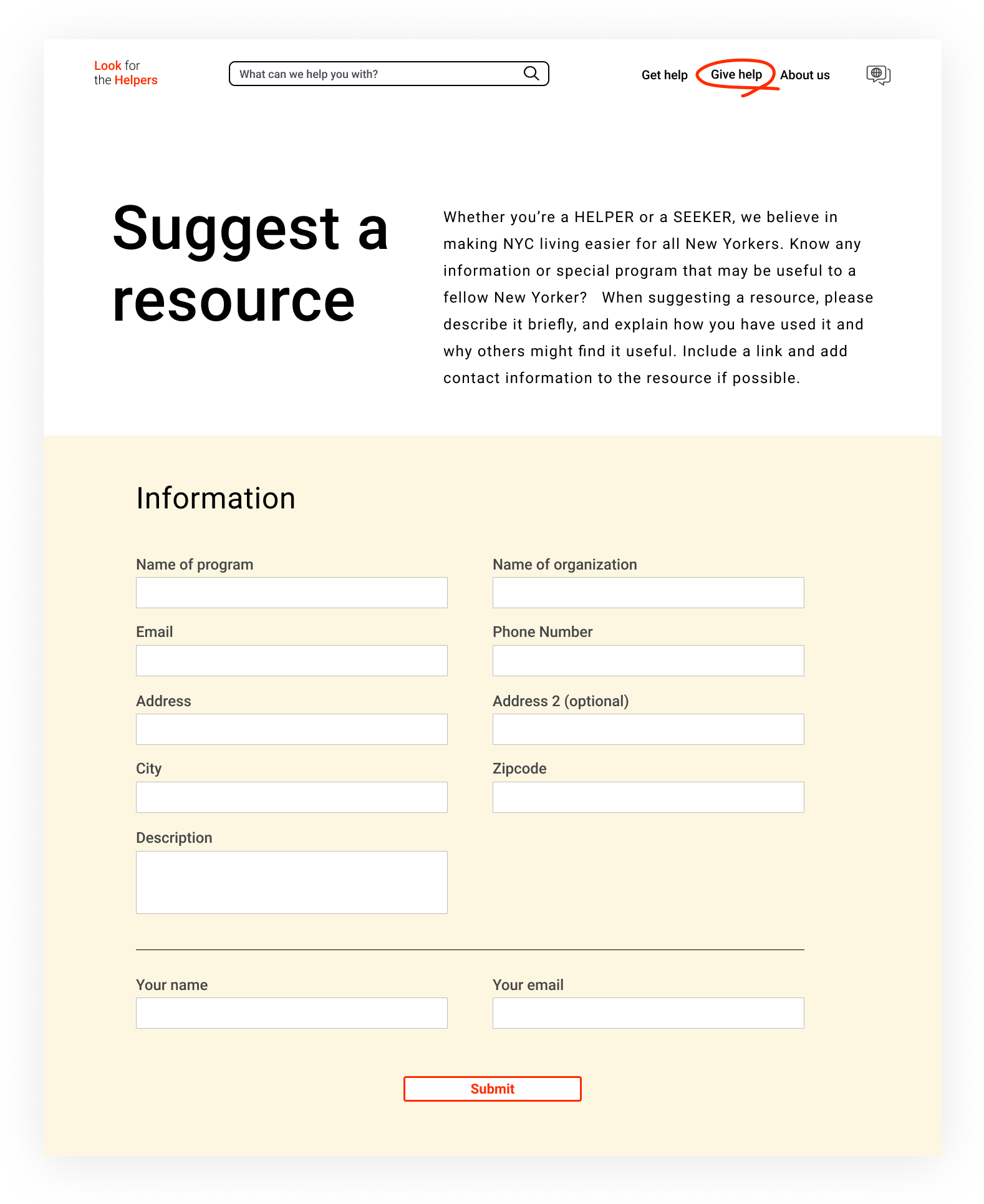
- Users can connect to a helper at any time, or suggest a resource at the bottom left of the page.
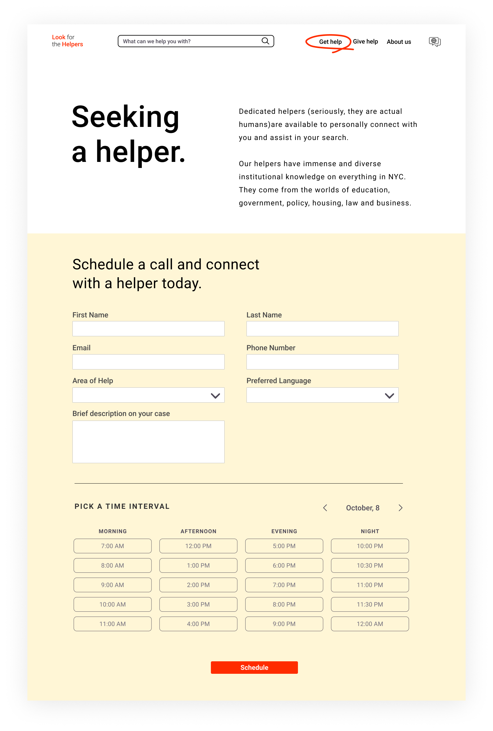
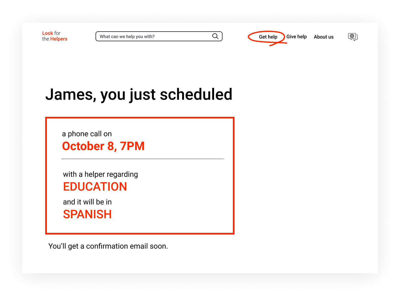
Connecting to a Helper
- If a user can’t find something or just wants a little help along the way, they can easily connect to a real person with experience in the topic via video or phone call.
- Users can select their preferred language for the help session.
Giving Help