Mentor Buddies
Redesigned the onboarding experience for Mentor Buddies, a mobile app where members can find a design expert to chat with privately in exchange for a small donation to a charity the mentor has chosen to support.
Project Goals
My team and I worked with key stakeholders: Mentor Buddies Founder and Director of Product Grace Ling, to develop a new onboarding process for Mentor Buddies. The current onboarding process saw high drop-off rates in a few key stages and our goal was to reduce these drop-off rates, increasing the number of new users who start their first chat session with a mentor.
Grace's Goal: Increase Conversion
We started by interviewing Grace Ling, the founder of Design Buddies and Mentor Buddies, to learn more about the current onboarding experience, and to dig into what was currently working (and not working) in the Mentor Buddies beta launch.
What's working?
Mentees are able to make connections with mentors on a personal level.
Mentors enjoy the experience, feel they're doing good for both the next generation of designers and the charity they're supporting in the process.
What needs to be improved?
People open app just to look around, but don’t sign up for mentorship. The goal is to decrease that gap.
Ensure mentees feel their matched mentors are an appropriate fit for them, tailored to their relevant interests and needs.
Possible decision fatigue - mentees are faced with a long list of possible mentors and have difficulty choosing.
User Interviews
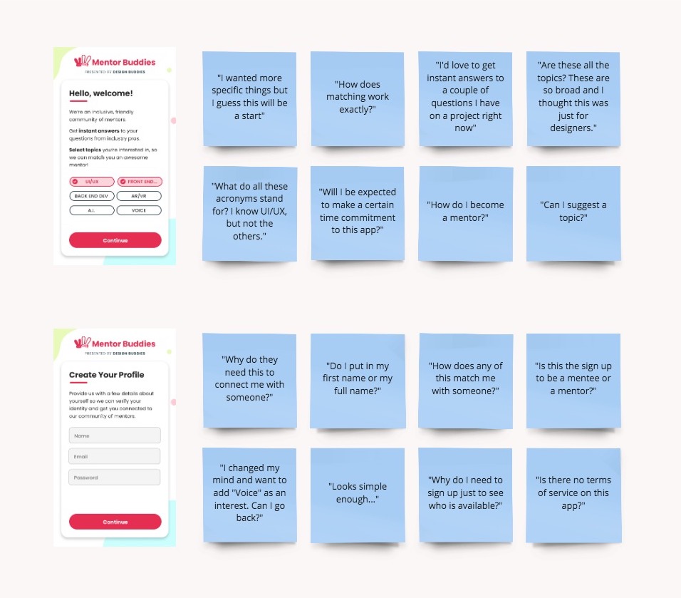
I conducted interviews with some existing Design Buddies members, to see how they reacted to the beta launch’s onboarding process. Some of their most common pain points were:
- The onboarding criteria did not feel specific or comprehensive.
- They did not understand why they had to create an account.
- They did not feel that their mentor matches were accurate or personal.
Analytics
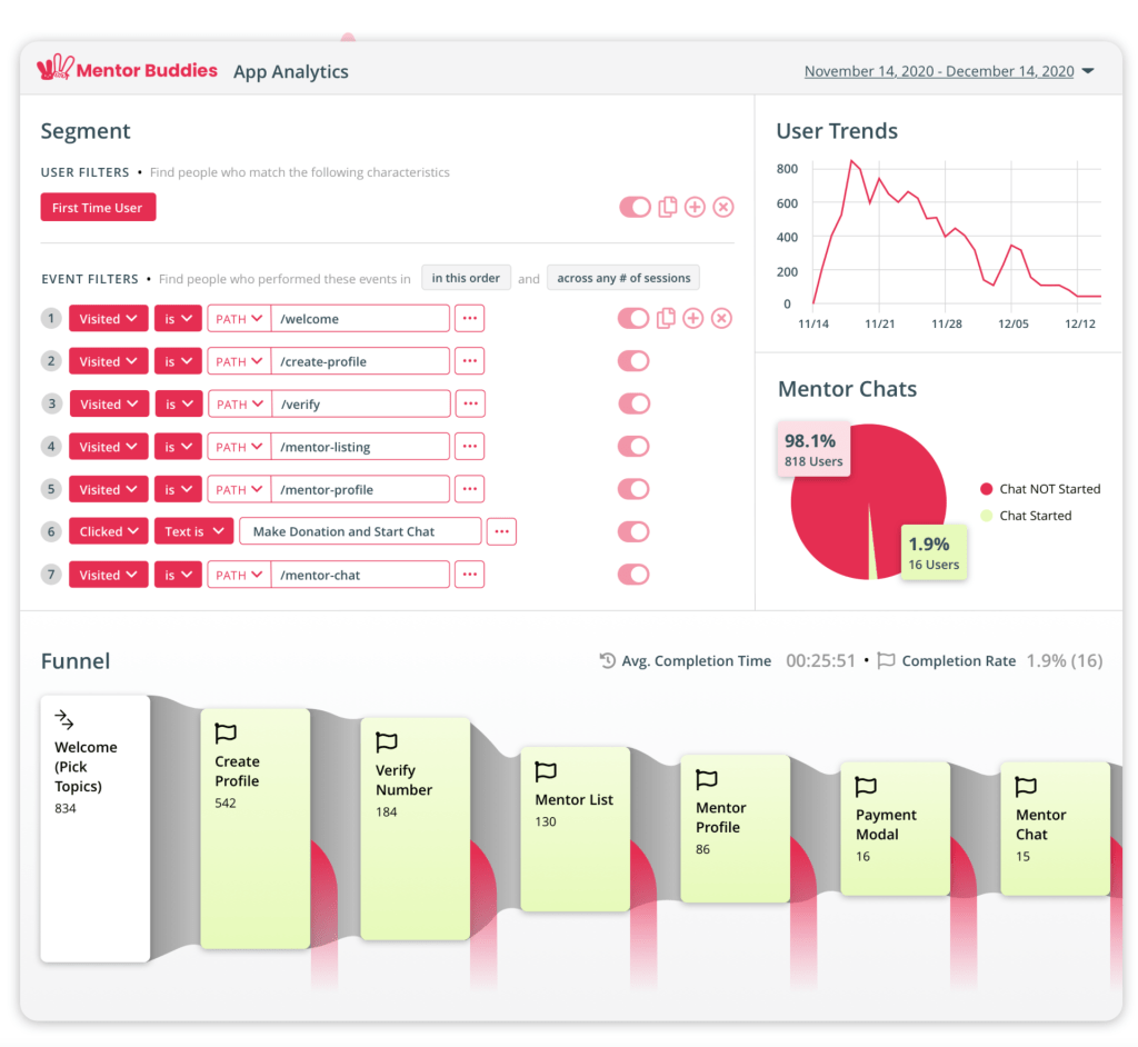
I analyzed these user interviews along with Mentor Buddies' analytics to identify key points of friction. Throughout the onboarding experience there were significant drop-off rates, I analyzed percentages at each stage of the onboarding funnel as well as time spent on screens to get a better understanding of users' pain points.
Welcome & Account Creation
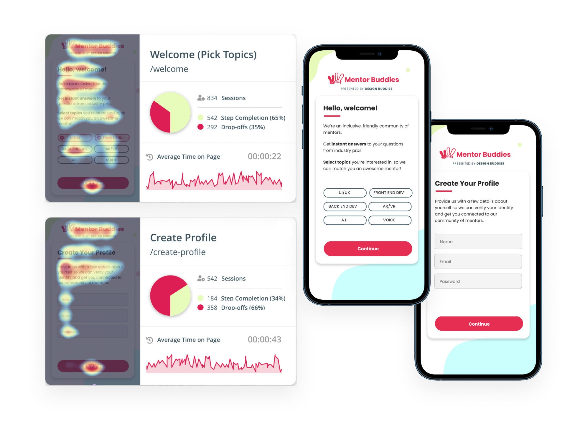
We see a peak drop-off at the account registration wall of 66%. I learned from my research that this single-screen welcome experience is not targeted enough and users leave because they do not see topics that relate to them. Users at this stage are skeptical and distrustful of the onboarding process, they are not invested enough to provide their personal information.

Recommendations
Based on these findings, I recommend expanding the list of topics and creating more specific areas of interest within each. This will help build user confidence they are getting matched closely within their interests.
We can compound the effect for a more targeted welcome experience by previewing their results prior to registration, as well as incorporating UX writing to bring the user into understanding the need for account creation.
Mentor Match Screen
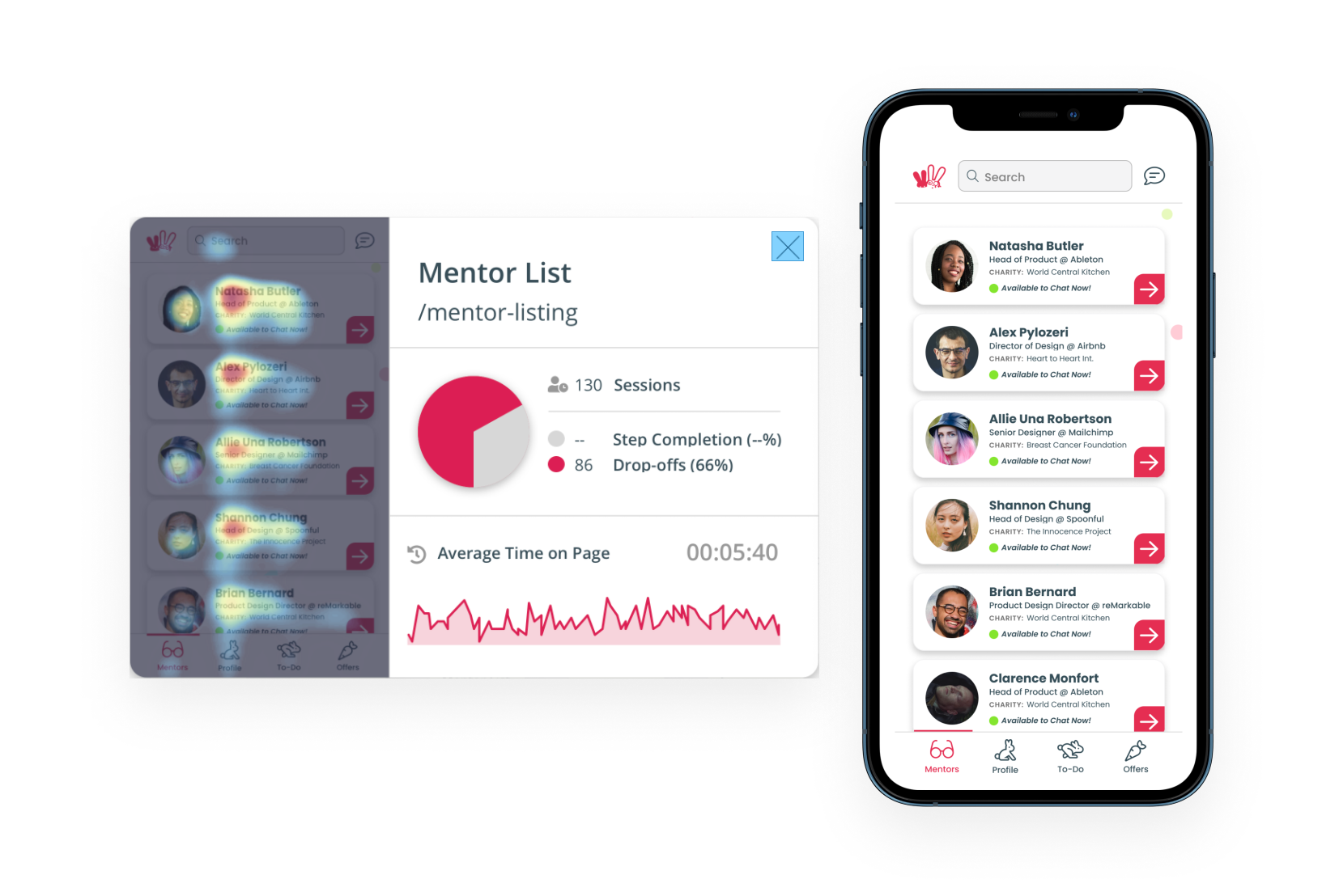
Next we see a particularly high drop-off when users get to the Mentor List Results. They are spending a very long time on this page, 5 min, and frequently leave the app without making a selection. I learned from user research that users are overwhelmed by the long list and wonder if these results are really tailored to them. They would like the ability to further refine the results at this stage.
Recommendations
To solve for this I asked how we might make users feel more confident that the mentors they can choose from will be a good match for them?
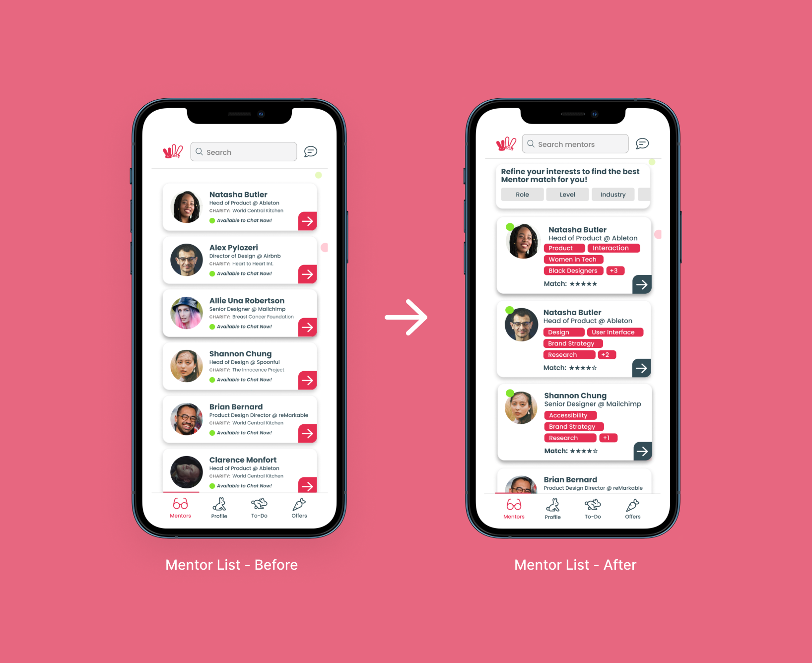
By adding a match strength percentage along with tags showing matched interests and affinity identifiers to each Mentor card, users will be able to more easily identify the personalization involved in their matches. These will increase the perceived relevance of matches and increase the likelihood users will move on to the next step in the funnel.
Developing a Solution
While there were medium to high drop of rates at a few points in the process, analyzing them in combination with user research led me to focus on three key areas: The Welcome screen, the Account Signup process, and the Mentor Match screen.
How might we design an onboarding experience that new users trust and encourages them to start their first mentor session?
Welcome Flow Redesign
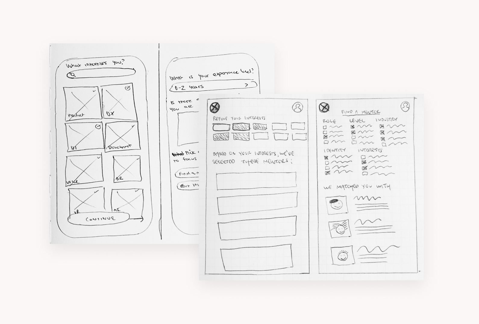
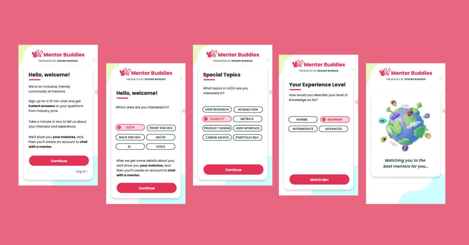
To address this point of friction, I decided to expand the initial welcome flow to 3 screens, emphasizing asking better questions and offering more specific and targeted information to the user. Based on the user feedback that the original categories were too broad, this new flow is designed to increase personalization and make users more confident in the quality of their matches.
Account Signup Redesign
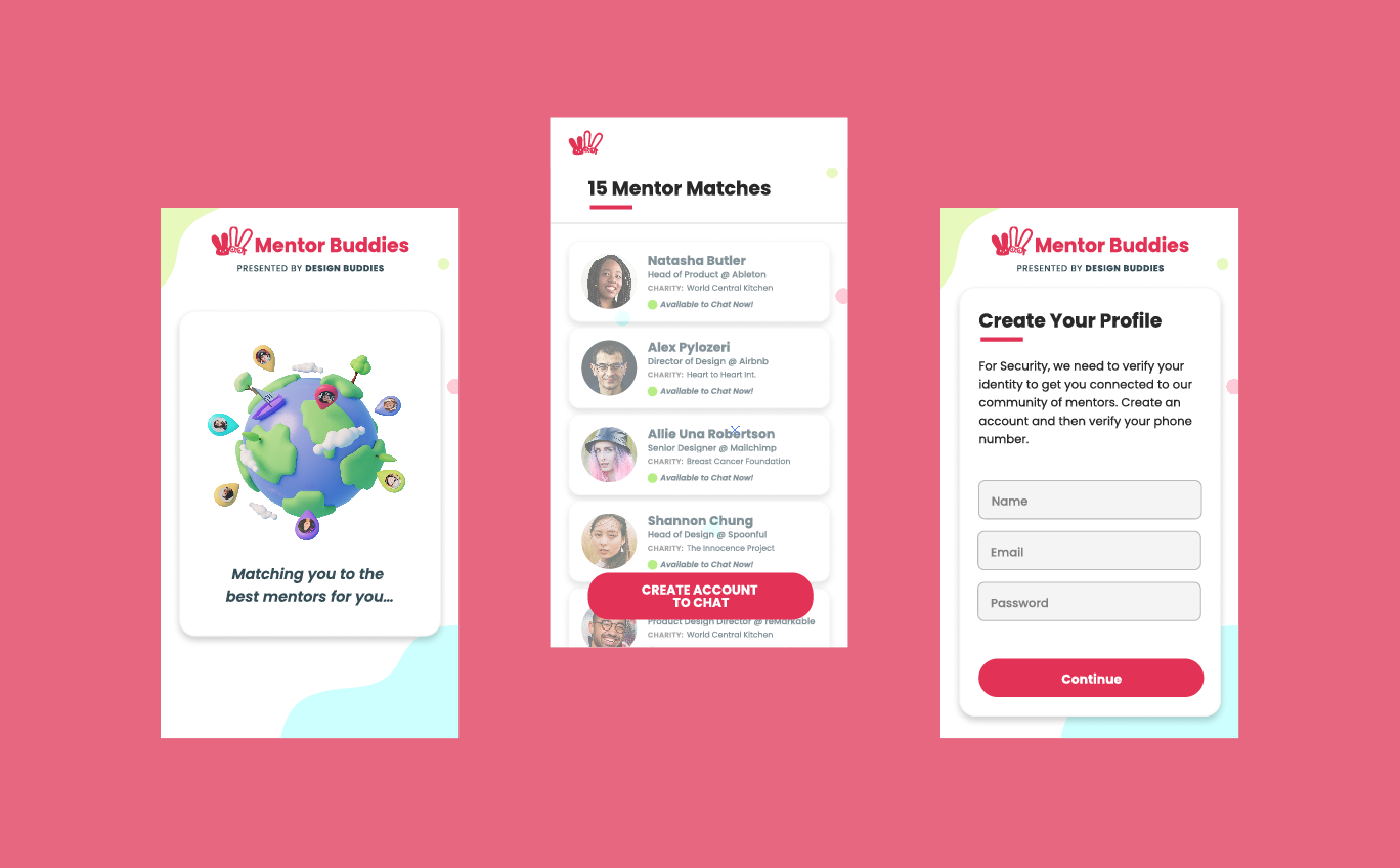
The immediate requirement for users to create an account with no explanatory context after the very brief and generalized welcome flow created another 66% drop-off at this point, leaving a very low percentage of users moving forward. This prompted me to ask: How can we amplify the results of this new, targeted experience to create trust and buy-in with users before requiring them to create an account?
To address the point of friction and high drop off rate at this point, I decided to show users their available matches before asking them to sign up, and telling them why the app needed their information. Based on the feedback that users didn’t know why they had to sign up, we believe that by moving the account creation to after the user has already input their interests and seen the mentors they've already matched with will show users the value of signing up, incentivizing them to create an account.
Matched Mentor List Redesign
With an average time on page at 5:40 along with a 66% drop-off rate, users were getting stuck on the Mentor List page, leaving the app before starting a chat. In our interviews and usability tests people told us they had trouble prioritizing among their matches and understanding who would be the best fit for them. I redesigned this page to show users a match rating with mentors based on the interests and attributes they selected in the expanded onboarding flow. I also added more mentor information on each card-- their interests, specialization, and self-selected identity categories, making it easier for mentees to get a sense of each person and find the best match right from the list page.
Results & Learnings
By addressing drop-off rates early in the onboarding process through expansion of the welcome screen we were simultaneously able to reduce drop-off later on the Matched Mentor list screen by providing users with a more targeted list of mentors.
We’ll measure success by increased conversion through the onboarding flow overall, and a decrease in drop-off on the key screens we’ve identified.
The next steps are to release the new flow to select, random, new users and analyze the change in conversion rate. Simultaneously, user interviews on the new flow will give us insight into how the new flow has increased trust in matches.